- 16 Oct 2020
- Kevarnold
- Comments: 0
This post looks at different modeling techniques when working with dates. It is a topic covered quite a bit, but I still receive questions. I plan on using this post to help with those conversations.
When your data has multiple dates, for example, Order and Ship dates, you have various options. I will provide examples of when you would consider each technique.

<tl;dr>
When working with dates, transform your model to the best practice. The PBIX and source is available on GitHub
Shaping the source
The source data is an Excel spreadsheet extract from a sales report. The first step is to transform this into a model that serves the reporting requirements. The result is a Sales fact table, a customer dimension, and a product dimension.
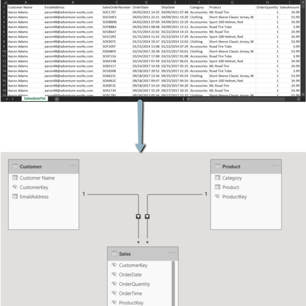
Now, let’s take a closer look at the two dates. You will notice that the dates have the time as well. It will need to be separated to link to the calendar/date table correctly. You will store the time separately. I will show later in this post how to use this data. After this transformation, each date column only contains the date portion.

Using the best practice
The best practice adds a date table to the model. This table contains the different columns that assist with meeting the reporting requirements, for example, Time Intelligence. It relates to the sales fact table using the Order Date and Ship Date’s value. Only one of the relationships can be active, which is indicated by the solid line. The arrow in the image below points to the inactive relationship, which connects to Ship Date.
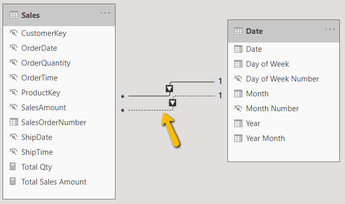
When a visualization slices a measure by the Date table, the active relationship will be in scope. You can override this behavior with a simple DAX CALCULATE as follows:
Sales[Ship Date Total Qty] =
CALCULATE ( [Total Qty],
    USERELATIONSHIP (Sales[ShipDate],'Date'[Date] )
)
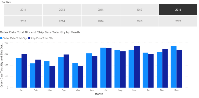
This code uses the Ship Date relationship instead of the active relationship via the USERELATIONSHIP function. It allows you to produce a visual to compare measures, as shown below.
Reviewing another option
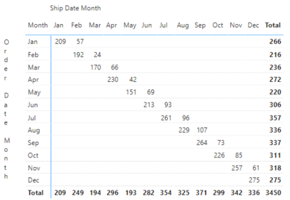
There are a small number of use cases when you consider a different modeling approach. You could have a requirement to slice by both dates on the same report page. Another use case charts a measure with each date on an axis. Here is an example that shows Total Qty ordered to shipped by month.
I change the model by adding a second date table. The fact table has an active relationship with each date table. The change introduces challenges trying to visualize Order and Ship values on the same page. You can review the page named “Side by Side” in the available download. It shows how both date tables require filtering. I accomplished this by using the Sync Slicers “Advanced options” to group them. I also had to set the interactions between the visuals correctly.
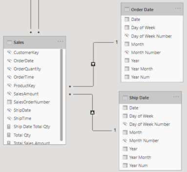
I then had to add another measure to recreate the clustered column chart shown earlier. The measure applies the current Order Date filtering to the Ship Date and removes the Order Date filtering.
Ship Date Total Qty =
   VAR _YearFilter =
      TREATAS ( VALUES ( 'Order Date'[Date] ), 'Ship Date'[Date] )
   RETURN
     CALCULATE ( [Total Qty],
           _YearFilter, REMOVEFILTERS ( 'Order Date' )
     )
Providing the combined date and time
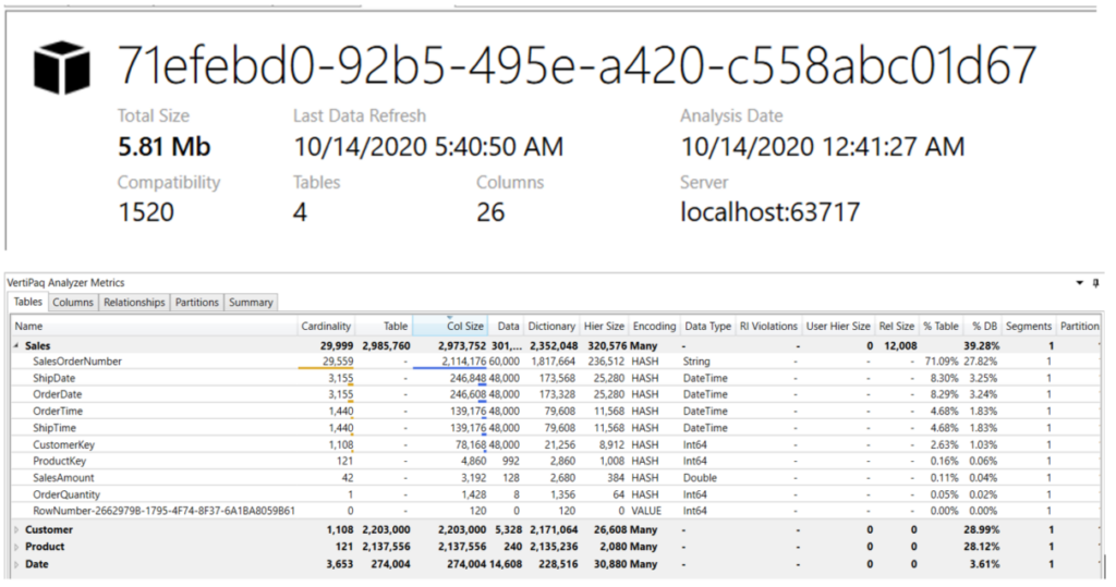
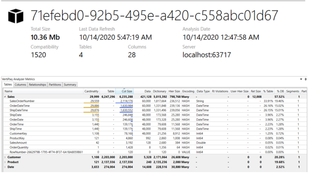
When there is a demand to provide the combined DateTime data type, I recommend producing a measure. I do this instead of keeping data in a column to reduce the model size. I tested this by capturing the model statistics before and after adding the columns. The model size just about doubled due to the poor compression.
Sales[Order Datetime] =
   IF (
        HASONEVALUE ( Sales[SalesOrderNumber] ),
            MIN ( 'Sales'[OrderDate] ) & " "
                & MIN ( 'Sales'[OrderTime] )
       )
Which approach should you use? I recommend starting with the best practice. When your requirements drive you to another method, make sure it is justified and test performance and size.
Do you have a different approach? Have you needed to move away from the best practice?
If you have any questions on modeling dates, please let me know.